Been visualising data a lot lately.
Scatter charts, realtime indicators, good ol' line charts and, of course, tables.
It's really easy to fill the screen with loads of information, screaming colours and as many numbers floating around the screen. This makes orientation difficult for the user, especially non-technical users.
Some of our users simply need insights and recommendations, but need the graphs for credibility.
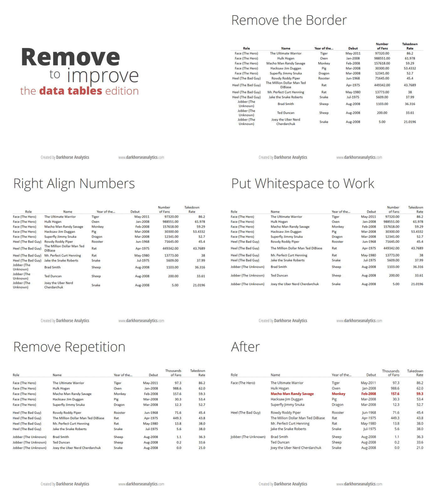
This is a great post from darkhorseanalytics explaining how a good table looks like. [hint - not your good ol' office 1998 excel highlight table]
http://darkhorseanalytics.com/blog/clear-off-the-table/


No comments:
Post a Comment